
Deca Productions needed a full redesign of their outdated website to align with modern UI standards and improve clarity, hierarchy, and user flow. The original site had no clear visual structure, confusing navigation, and low engagement. The goal was to create a modular, user-centered interface that improved task completion and brand presentation.

Context
Discovery
Pain Points
- Outdated information

- Lack of key information

- Complicated Navigation

- Visual design issues


Paper Wireframes
I believe it was important to create paper wireframes to get a basic idea of the construction process and examine the architecture in a simple and quick way. Once defined and approved by the client, I like to refine these designs digitally using Figma.
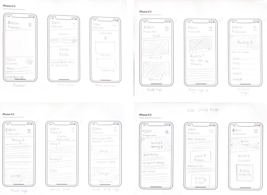
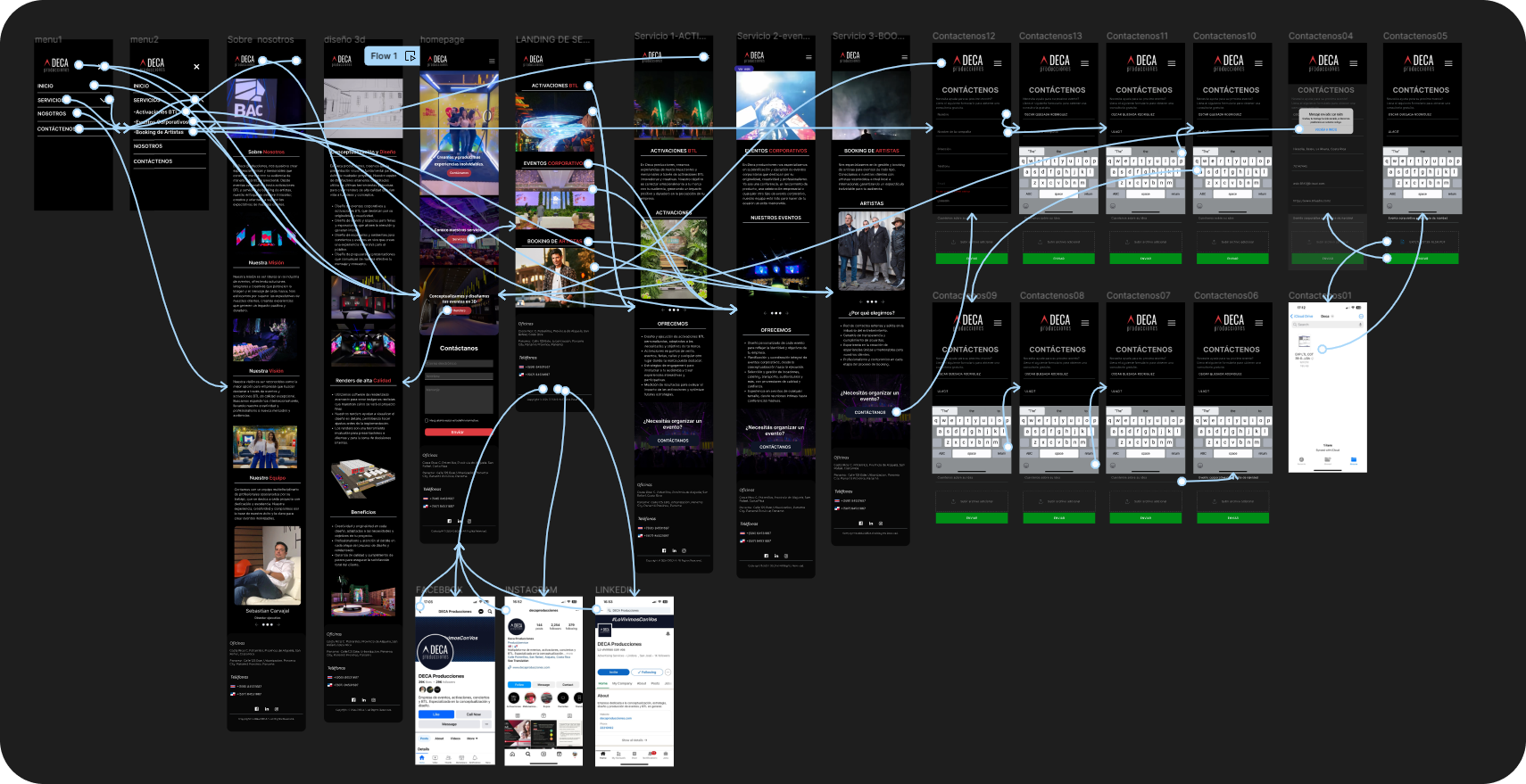
Wireframes
As part of the redesign, I developed a set of mobile-first wireframes to ensure the experience remained intuitive, efficient, and visually consistent across devices.
These wireframes focus on:
-
Clear hierarchy and touch-friendly navigation
-
Condensed content blocks for faster scanning
-
Seamless transitions between key screens like Homepage, Services, and Contact

Usability testing
With 27 participants from diverse backgrounds, ages, genders, and skill levels, I conducted the usability studies. Results:
- 100% of users successfully completed the task directly.
- The incorrect click rate dropped to 33.3%.
- The average time to complete tasks was reduced to 15.2 seconds.
Outcome
The redesign of Deca Producciones website successfully addressed the usability challenges identified in the initial phases. Key achievements include:
- Enhanced User Experience:
- A 100% success rate for users completing tasks directly, demonstrating significant improvements in navigation and accessibility.
- A reduction in task completion time to an average of 15.2 seconds, showcasing increased efficiency.
- Improved Design and Engagement:
- A visually appealing, dynamic, and intuitive interface that aligns with modern design standards and user expectations.
- Clear and concise content organization, eliminating confusion and making the website more user-friendly.
- Client Satisfaction:
- The final high-fidelity prototype and usability improvements met client approval, effectively representing the brand’s dynamic essence and functionality.
The project outcomes underscore a user-centered approach that not only meets business goals but also provides a seamless and engaging experience for its audience.