
Moonlight Productions, a leading event production company, sought to revamp the branding of their event truck. The project aimed to transform the truck into a moving representation of the company’s identity, serving as both an advertisement and a testament to their design expertise. By focusing on visually striking elements, the design would help establish a strong brand presence at events and while on the road. The goal was to create a design that not only showcased their creative identity but also communicated professionalism and contact information in a visually compelling manner.
Project Overview
Objective
The primary objective was to design a truck branding concept that:
- Embodies the company’s creative and design-driven ethos.
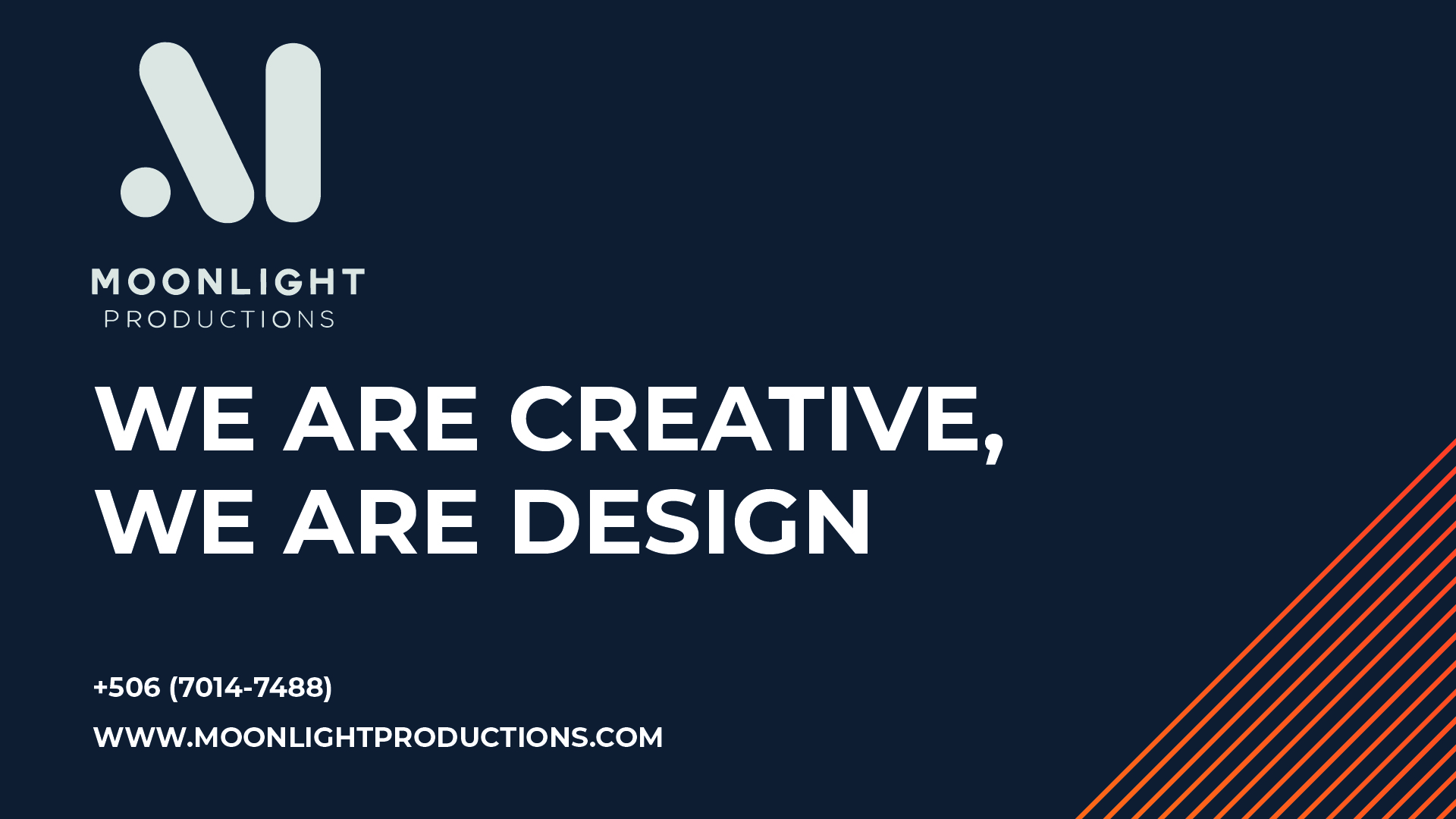
- Highlights the brand’s slogan: “We are creative, we are design.”
- Prominently displays key contact details and the company’s website.
- Utilizes the brand’s colors (#0a354f, white, and orange).
- Ensures high visibility and readability while the truck is on the road or parked at events.
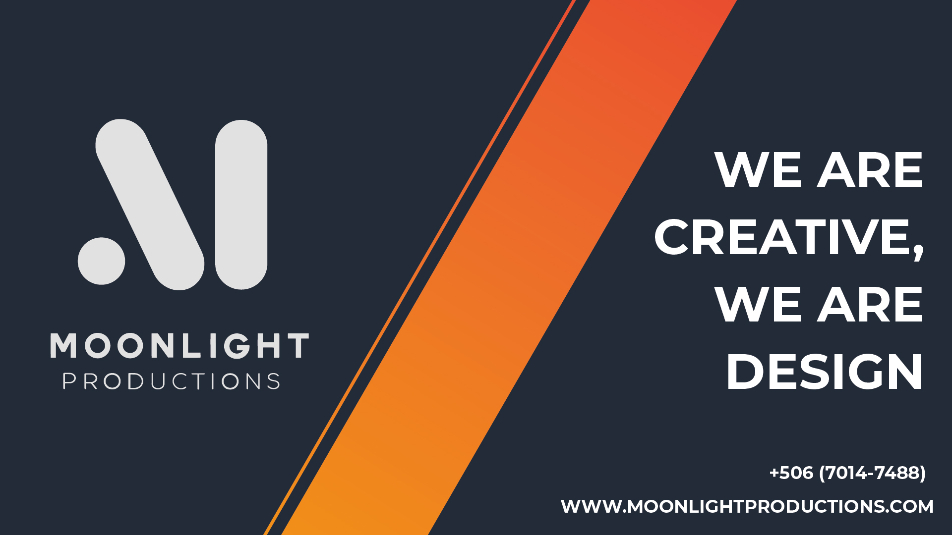
Sketches
Created realistic photomontages of the truck design in Adobe Photoshop, experimenting with different placements for the slogan, logo, and contact details to find the most cohesive and impactful layout.The client gave me full creative liberty for this first version, allowing me to explore different design possibilities freely.


Feedback and Refinement
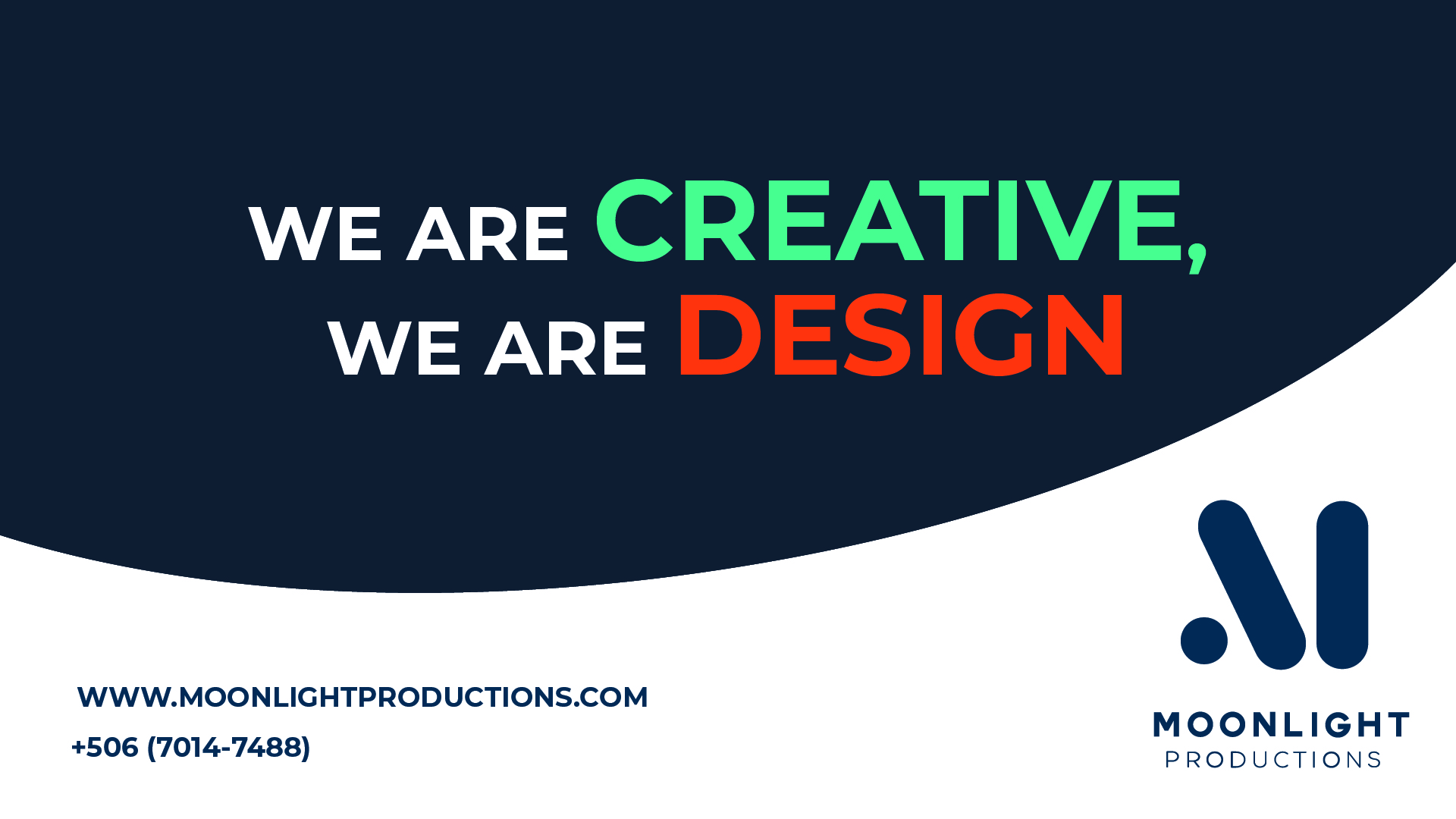
After presenting the first design, the client requested a more minimal and simple approach. They suggested incorporating graphic elements such as squares and circles that followed the three faces of the truck, creating a continuous and cohesive design across all sides.
Developed new sketches and mockups to reflect this feedback, emphasizing clean geometric patterns and subtle transitions between the truck’s faces.
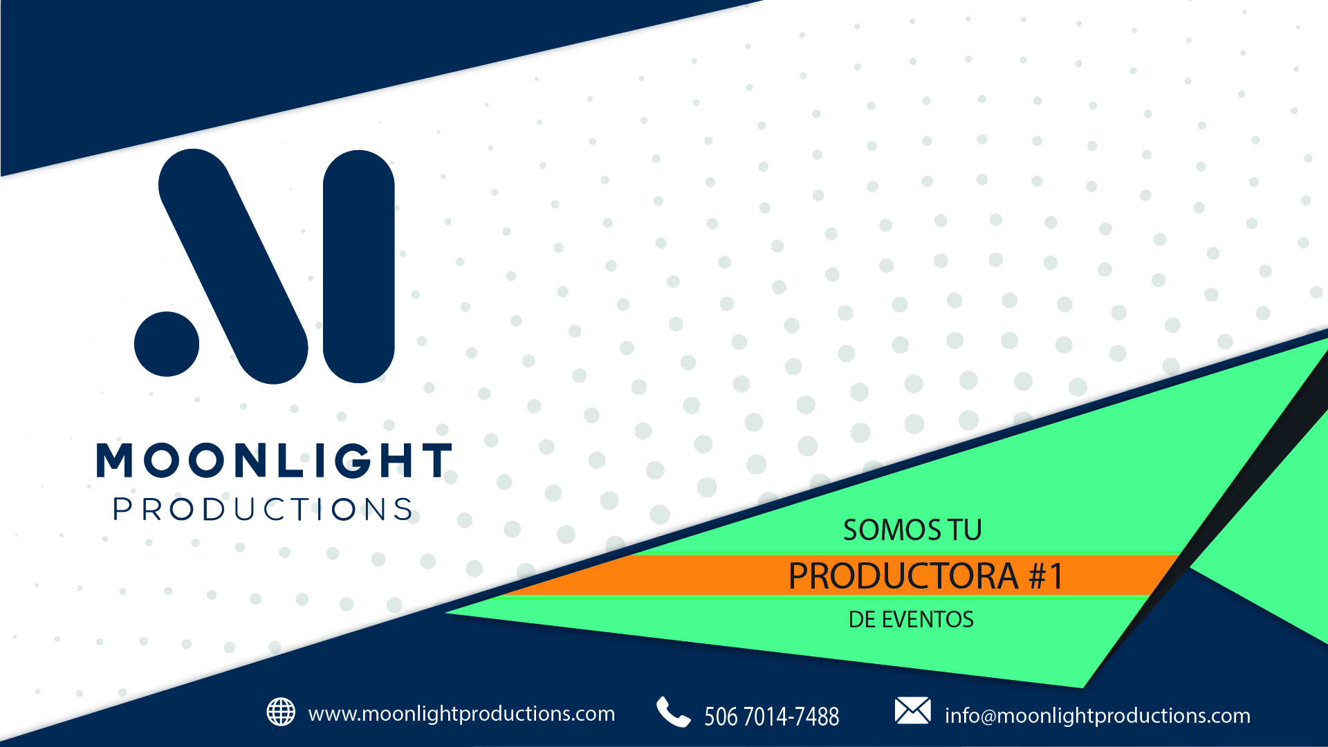
The client liked the last design but wanted more movement and simplicity in the overall composition. Based on this feedback, one more proposal was created to better incorporate their vision. They also requested that the phrase “We are creative, we are design” be integrated into the final design, so additional versions were developed to achieve this.

Design Execution
-
- Finalized the artwork in Adobe Illustrator for precise vector-based design.
- Used bold typography and clean layouts to ensure scalability and clarity.
- Incorporated the slogan, “We are creative, we are design,” as the focal point.
- Positioned the contact number and website for easy readability.
- Integrated graphical elements and color accents to enhance the visual impact and maintain continuity across the truck’s surfaces.
-
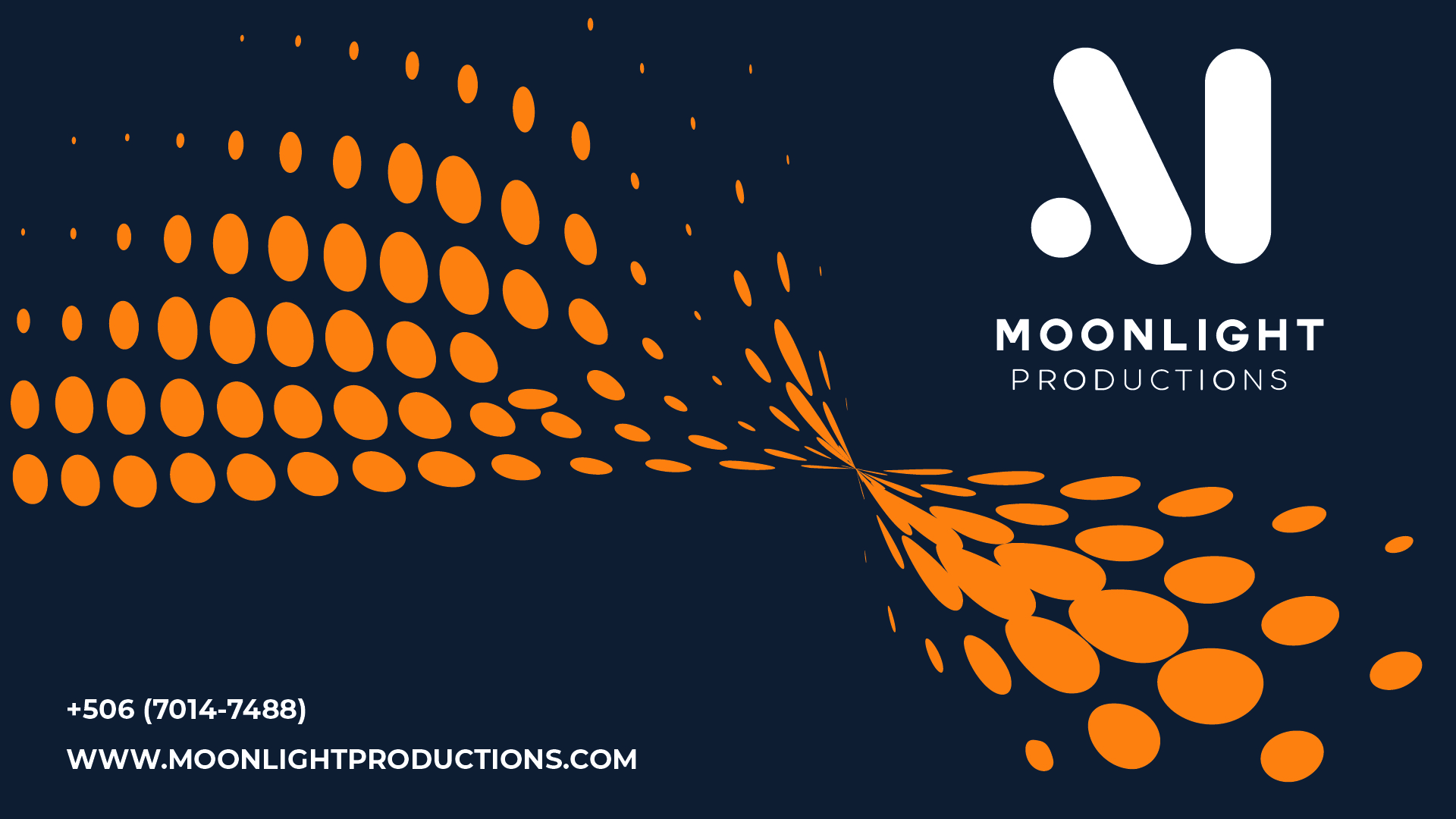
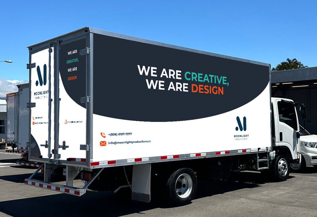
Created photomontages to simulate the design on the truck, providing a realistic preview.

Photomontages
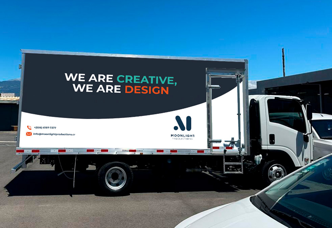
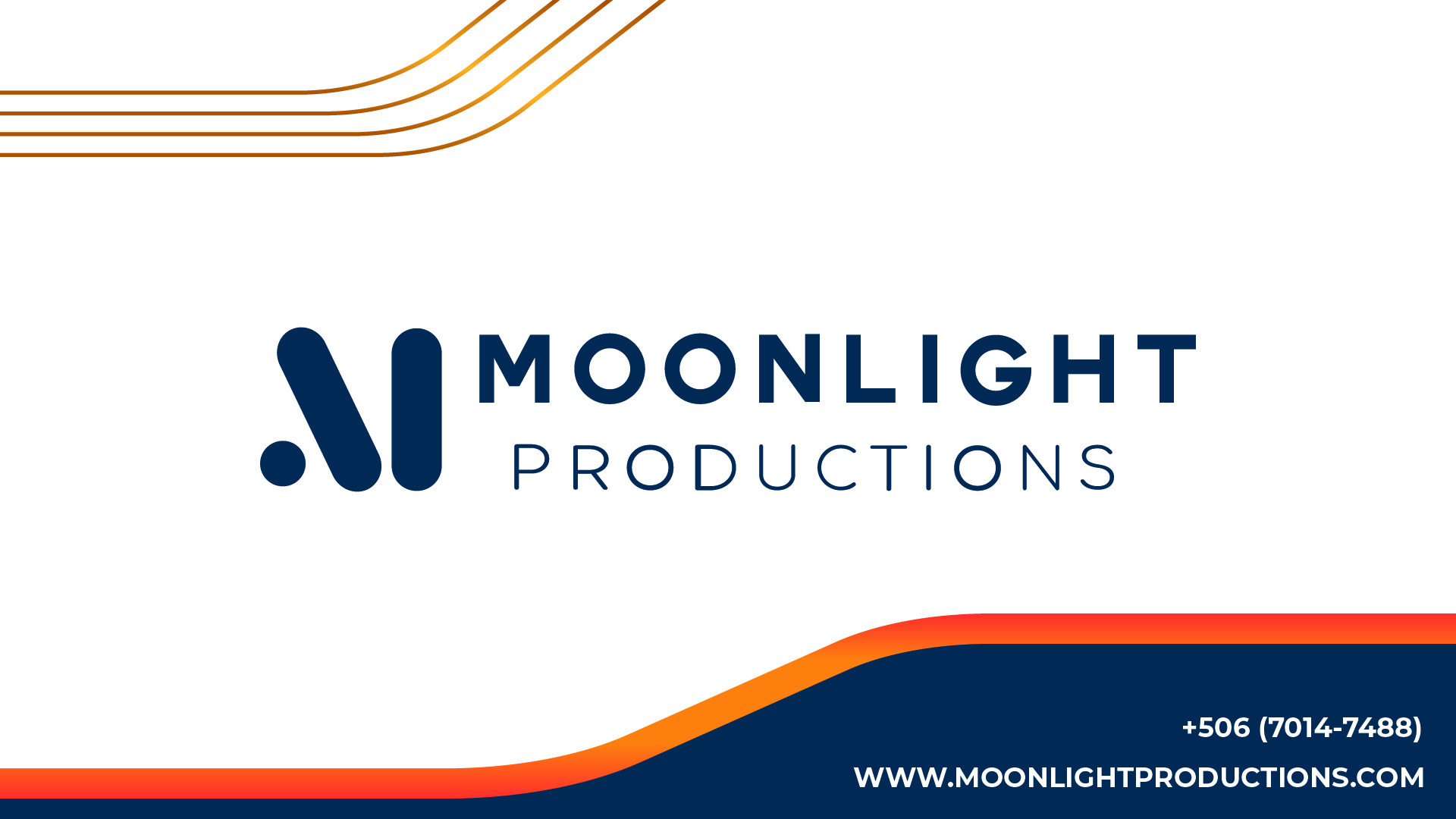
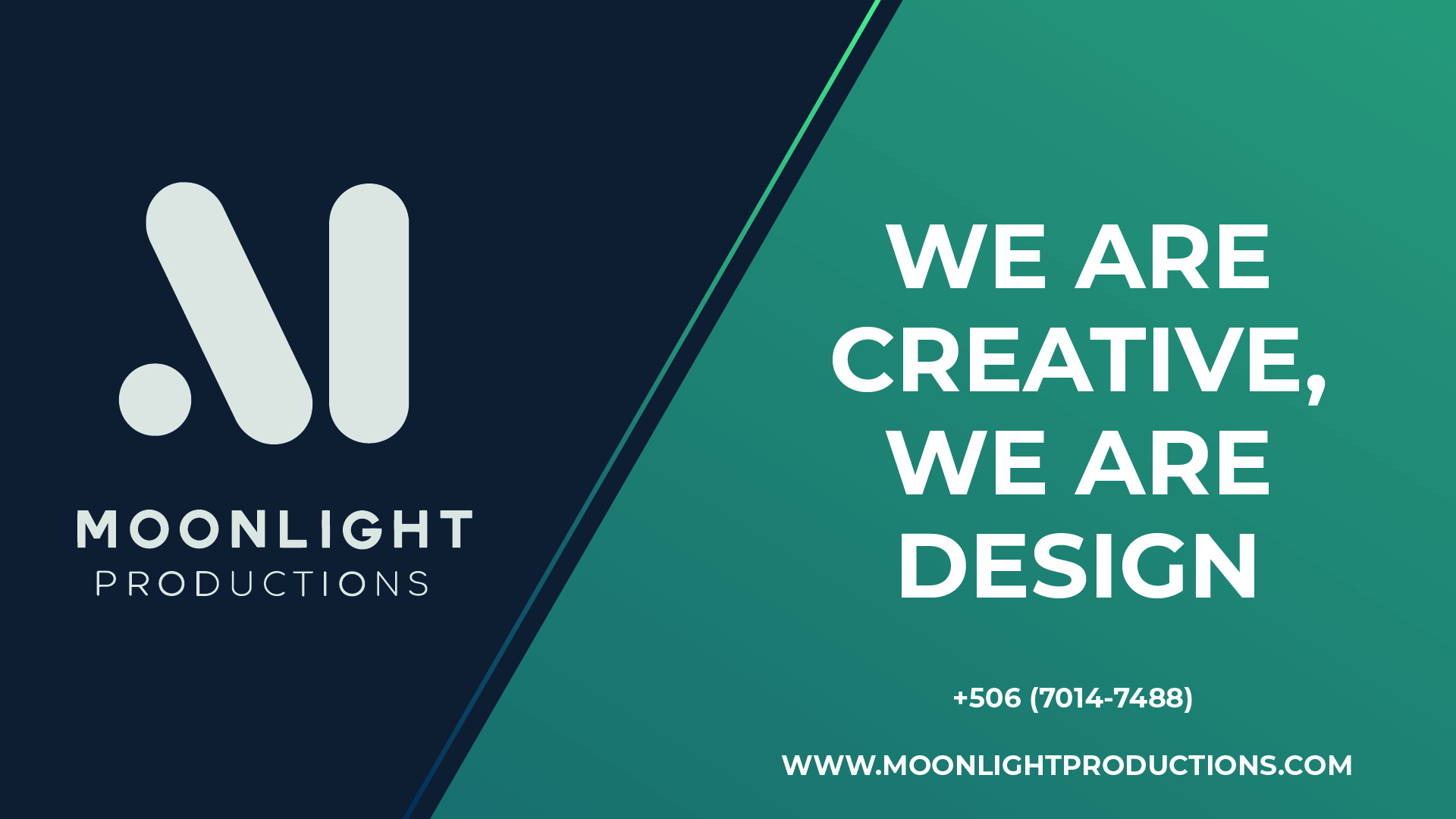
Final design
Delivered a minimalistic yet striking design with the following features:
-
- Dark blue (#0a354f) as the base color for a sleek and professional look.
- Orange and white accents to create contrast and highlight key information.
- Geometric elements (circles) to create a seamless flow across all truck faces.
- Large, bold typography for the slogan and contact details.

Outcome
The truck branding was successfully implemented and received positive feedback from both the client and their audience. The design effectively:
- Strengthened Moonlight Productions’ brand presence at events.
- Increased visibility and accessibility through clear contact details.
- Demonstrated the company’s commitment to creativity and design excellence.